
Glazer’s Camera
Glazer's Camera is a third generation, family-owned camera store in Seattle. I was a Graphic Designer there for 2 years, supporting the sales, marketing, and events staff by clearly communicating our offerings and reinforcing the Glazer’s brand as the Northwest's premier source for photo and video equipment and supplies since 1935.
Order Inserts
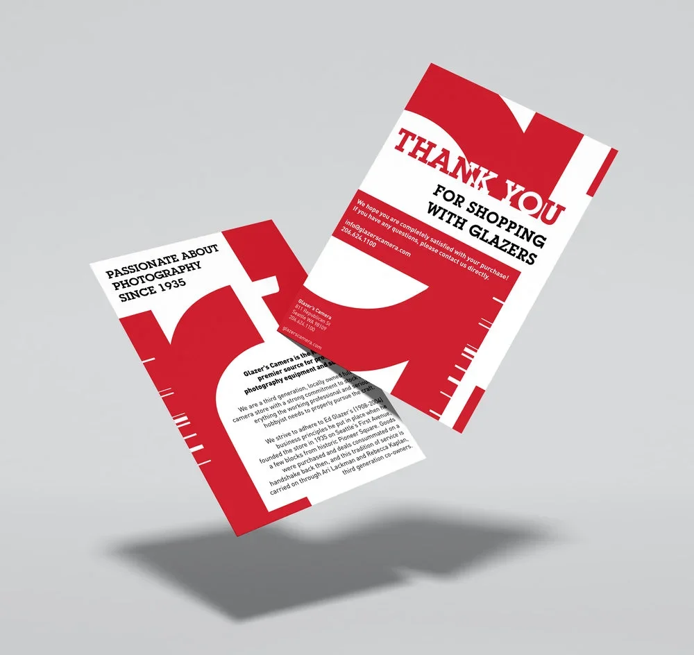
Glazer's has built its reputation on exceptional in-person service and deep product expertise — but as online and phone orders grew, that personal touch risked getting lost in transit.
I designed a graphic postcard insert for shipped orders that bridges the gap: thanking customers for their purchase, inviting feedback, and reinforcing the warmth and character of Glazer's brand. The insert serves both as a brand touchpoint and a subtle driver of repeat business, ensuring that every unboxing feels like it came from a place that genuinely cares.
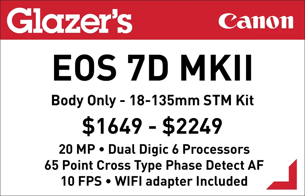
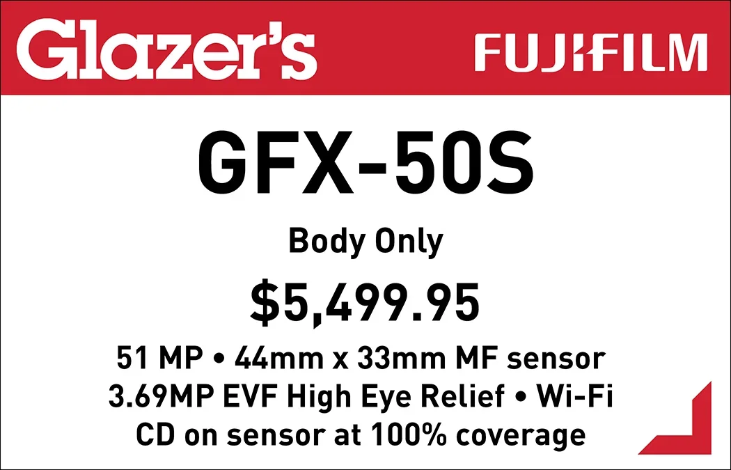
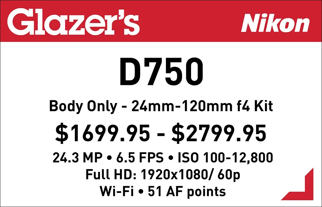
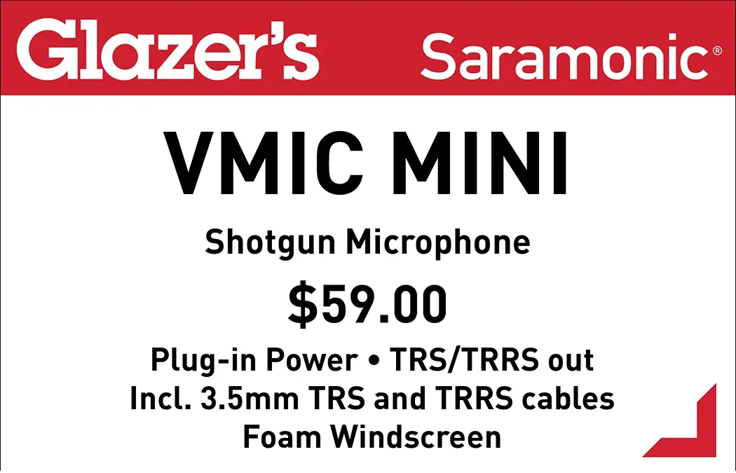
Camera Counter Tags
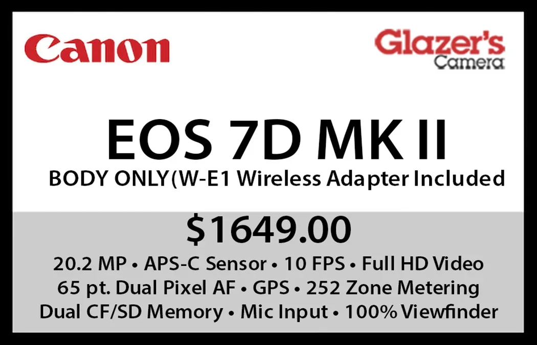
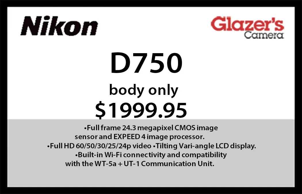
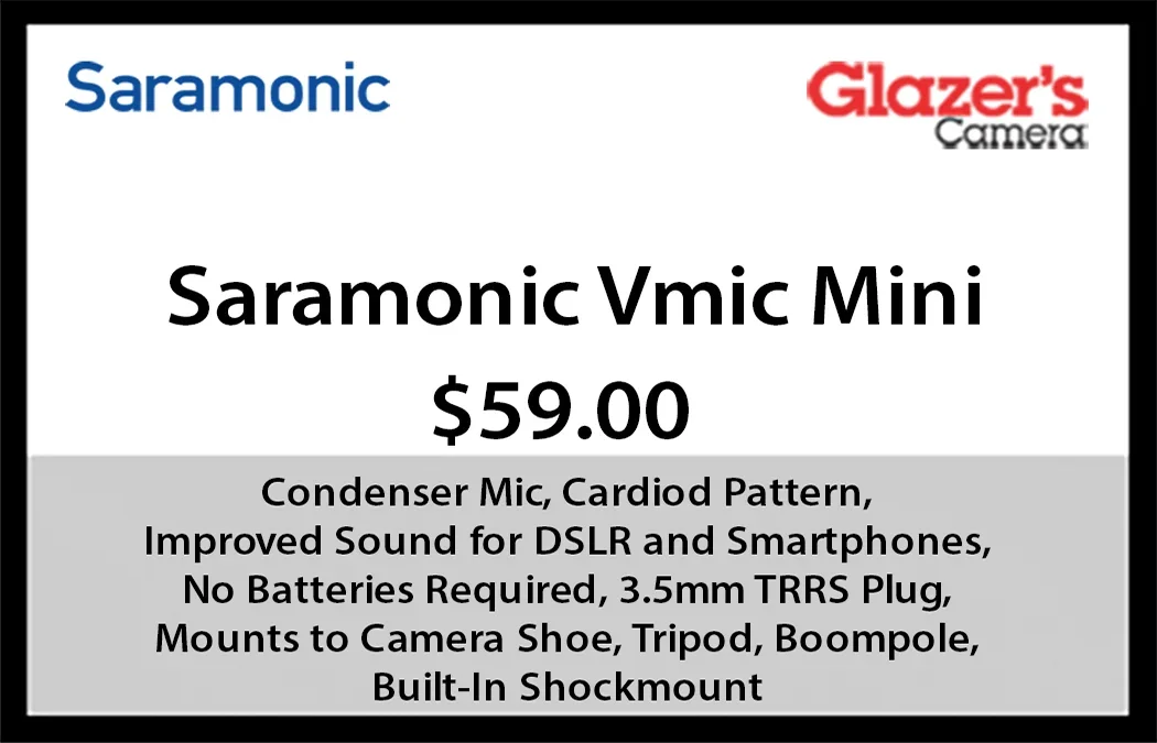
The camera counter tags in use before my redesign were inconsistent in layout, crammed with excess information, and often featured pixelated, low-resolution brand logos — a poor first impression for a store known for its expertise. I developed a set of standardized tag templates that establish visual cohesion across all camera brands while adhering to Glazer's brand guidelines.
Each tag is refined down to the most essential information a customer needs, and logos are sourced and reproduced at print-ready quality. The result is a cleaner, more professional display that reflects the care and knowledge Glazer's staff bring to every sale.

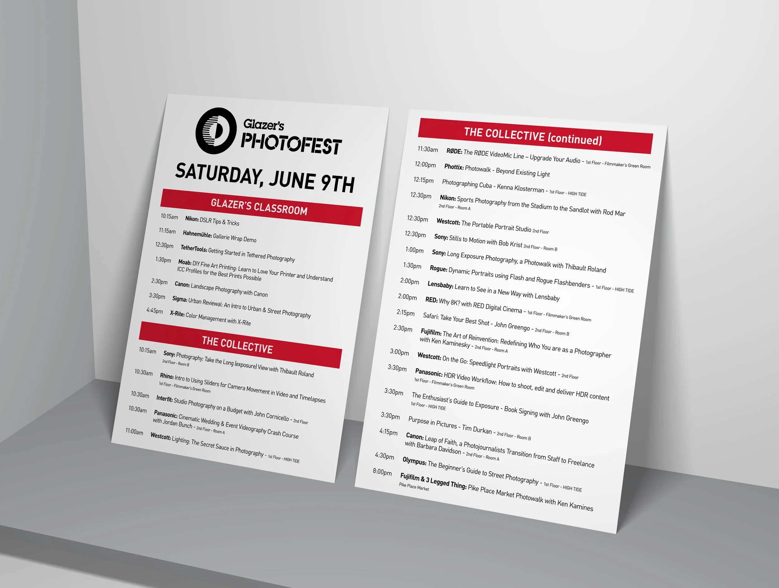
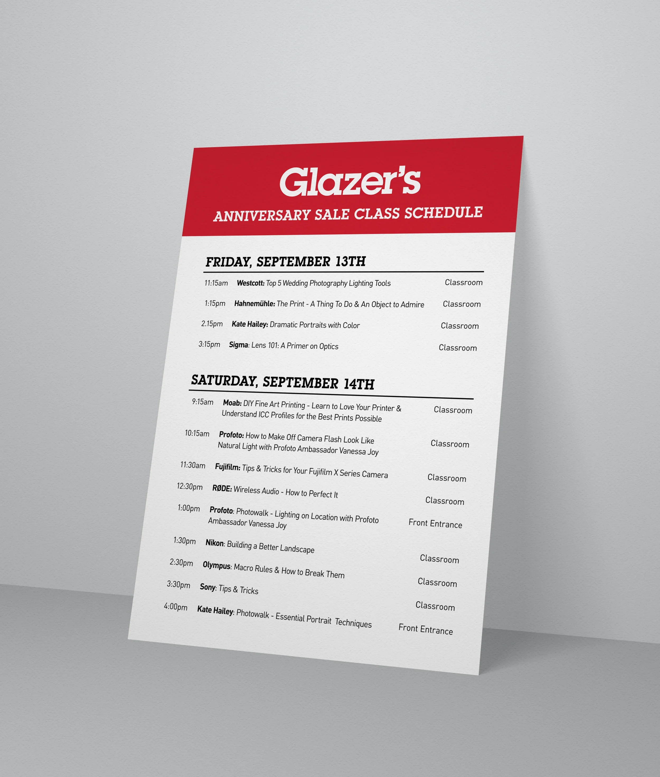
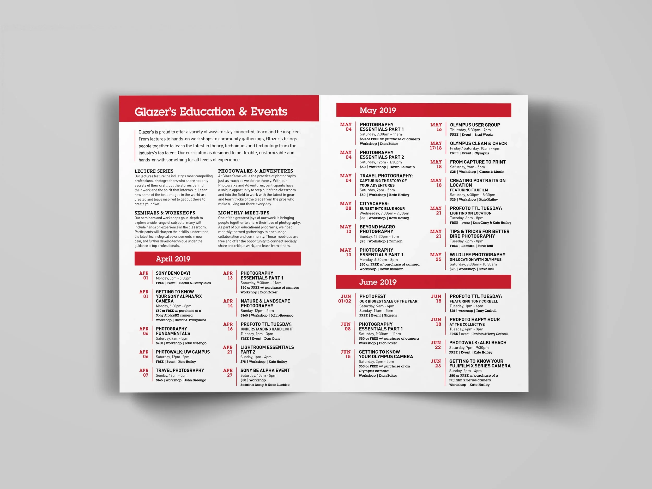
Event Schedules
Glazer's hosts three major sale events each year — Photofest, the Anniversary Sale, and the Winter Sale — each packed with workshops, demos, and lectures from industry experts. I designed the in-store signage for each event's schedule, balancing clarity and visual appeal so customers can quickly orient themselves, plan which sessions to attend, and find their way to each location. Each iteration is tailored to the tone and scale of the event while maintaining consistency with Glazer's overall brand aesthetic.
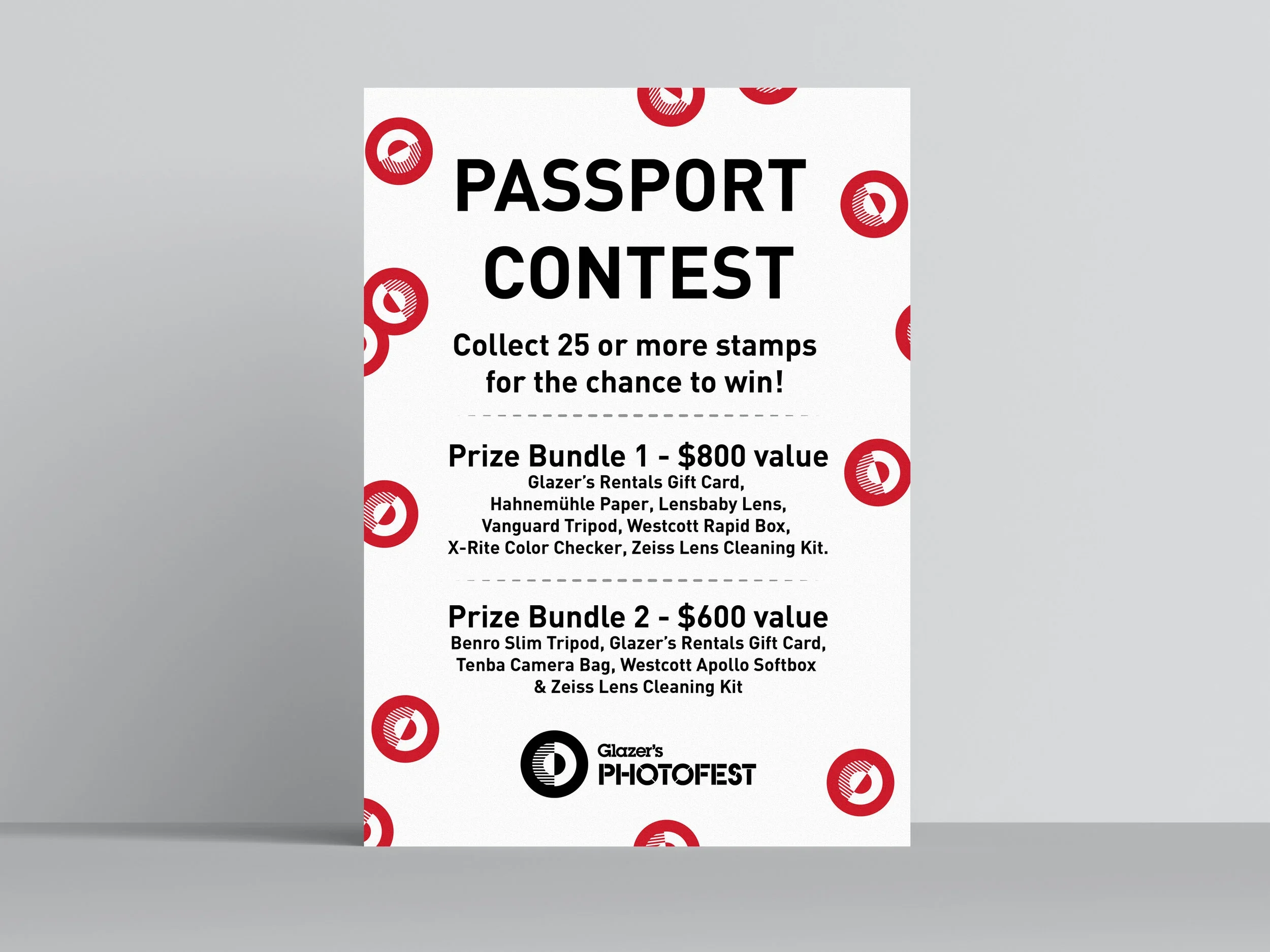
Contest Poster
Photofest, Glazer's flagship annual sale, features a Passport Program that encourages customers to visit Brand Representatives throughout the store, collect stamps, and enter a prize drawing.
I designed the contest poster to communicate the prize bundles clearly while capturing the excitement of the event. The layout keeps copy clean and scannable, and a repeating Photofest logo stamp pattern along the border adds a playful, thematic flourish — nodding to the passport mechanic at the heart of the promotion.
Brochures
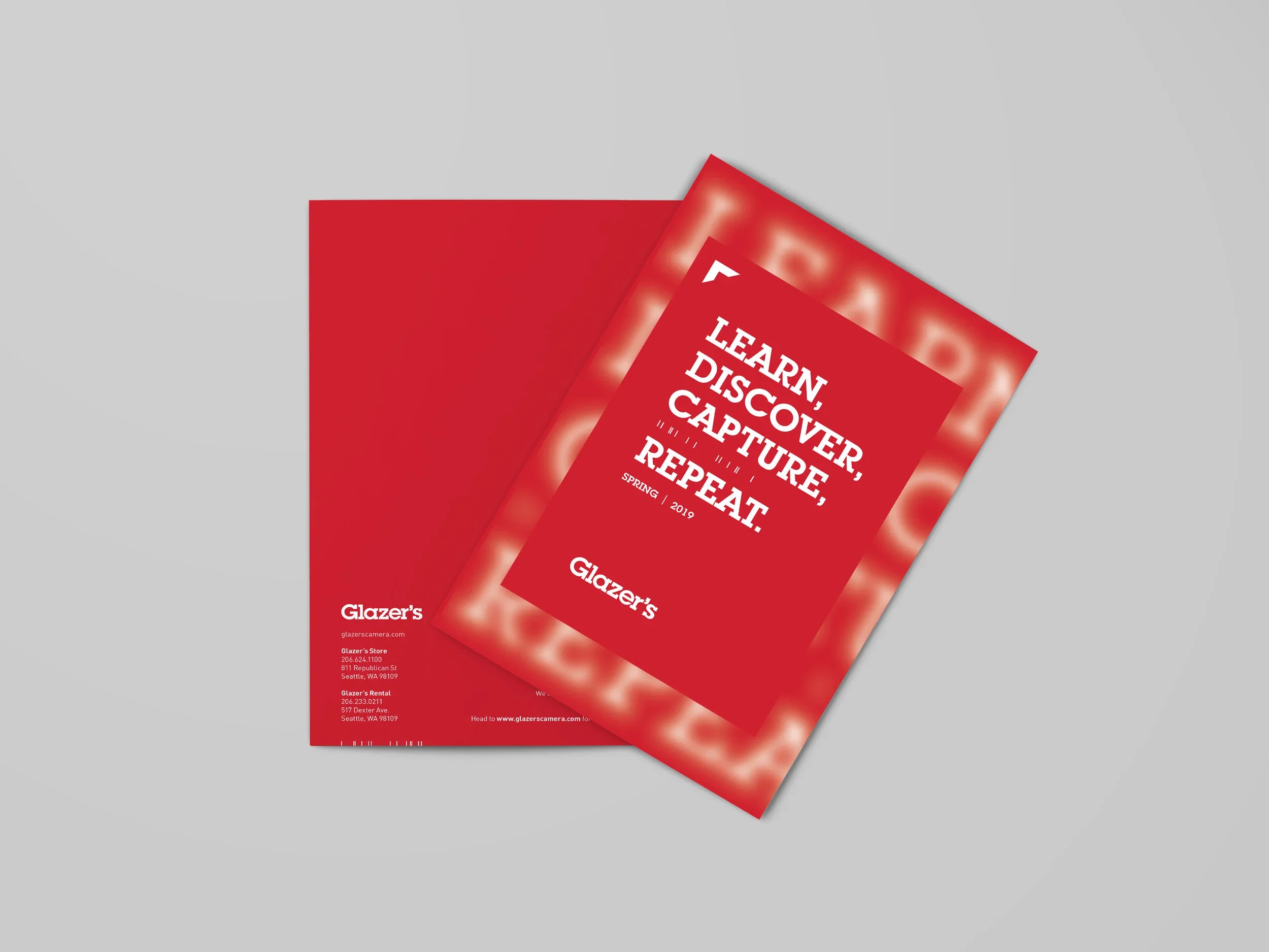
Seattle's photography community is active and engaged, and Glazer's works hard to serve it — hosting workshops, lectures, and events throughout the year. Each quarter, in collaboration with the events coordinator, I produced a brochure that gave customers a clear, organized view of what events they could look forward to. Every listing includes the essential details: date, time, cost, and instructor. The design prioritizes readability and ease of scanning, so customers get what they need at a glance without wading through dense text. The brochures have become a consistent, reliable touchpoint for regulars and newcomers alike.
Data Recovery Envelopes
The previous process for data recovery intake at Glazer's was informal to a fault: customer details handwritten on a blank windowed envelope, media tucked inside, and no standardized prompts to ensure critical information was captured. It didn't inspire confidence — and gaps in the intake notes often meant follow-up calls and delays.
Working with Glazer's data recovery specialist, I designed a printed label to put on manila intake envelopes that guides staff through collecting every necessary detail at the point of intake.
The redesigned packaging looks professional, sets the right expectations for customers, and meaningfully reduces the back-and-forth that slowed the process down.
Holiday Campaign
Art Direction & Photography in partnership with Chrissie White
For Glazer's annual holiday campaign, I partnered with photographer Chrissie White to pitch and execute a studio still life concept that put the store's cameras and lenses front and center — literally. Rather than leaning on the expected holiday imagery, we proposed something more elevated: a series of carefully composed product setups that felt festive and editorial at once.
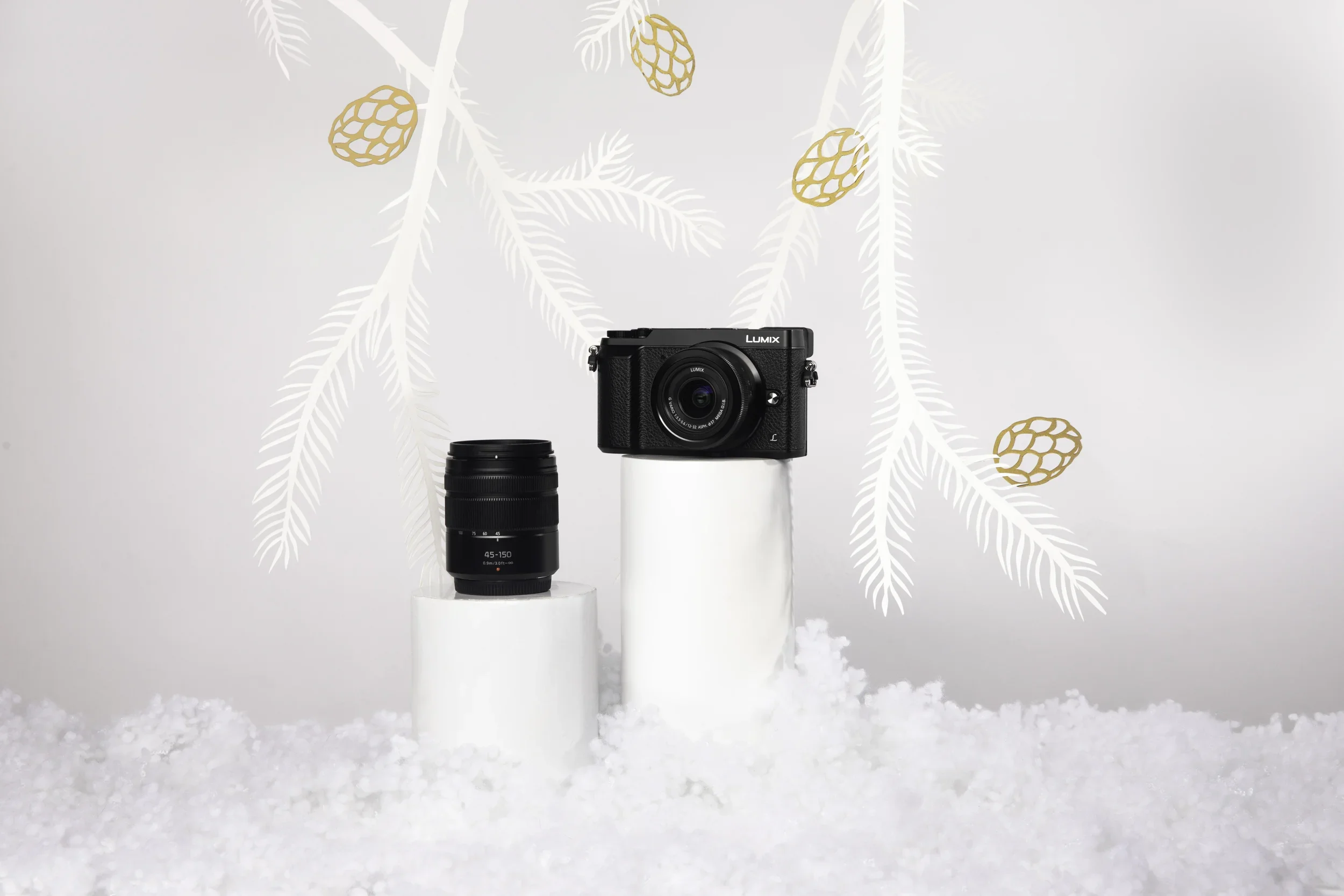
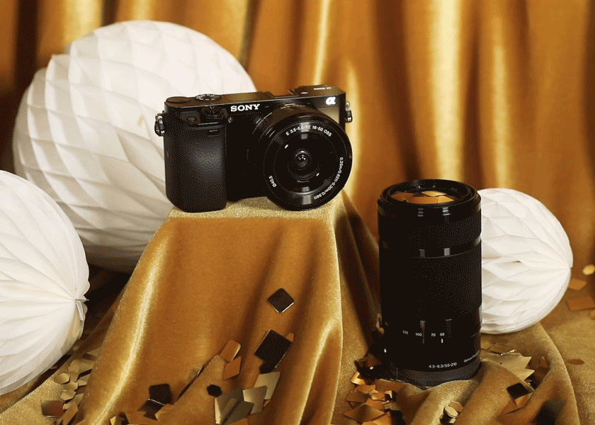
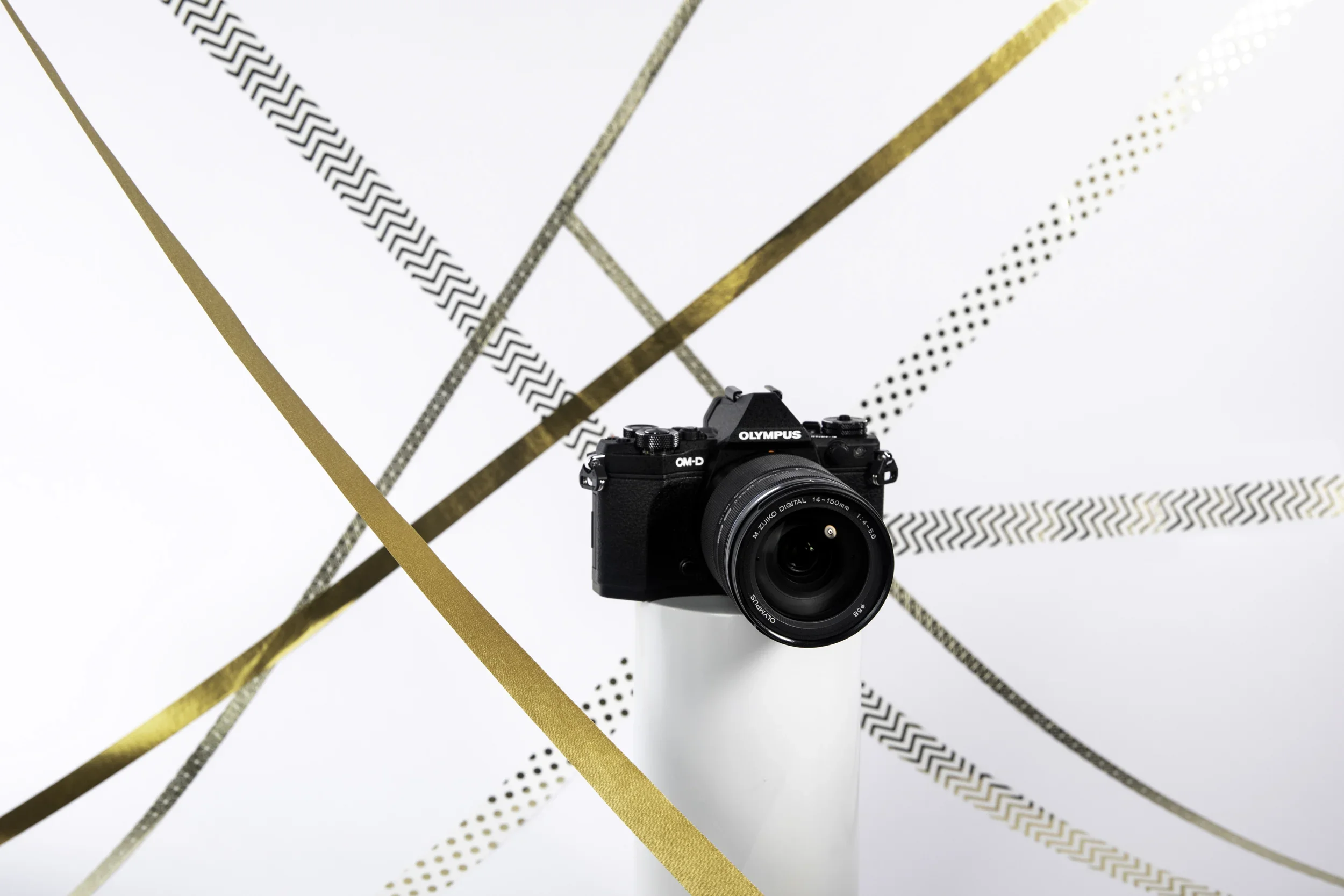
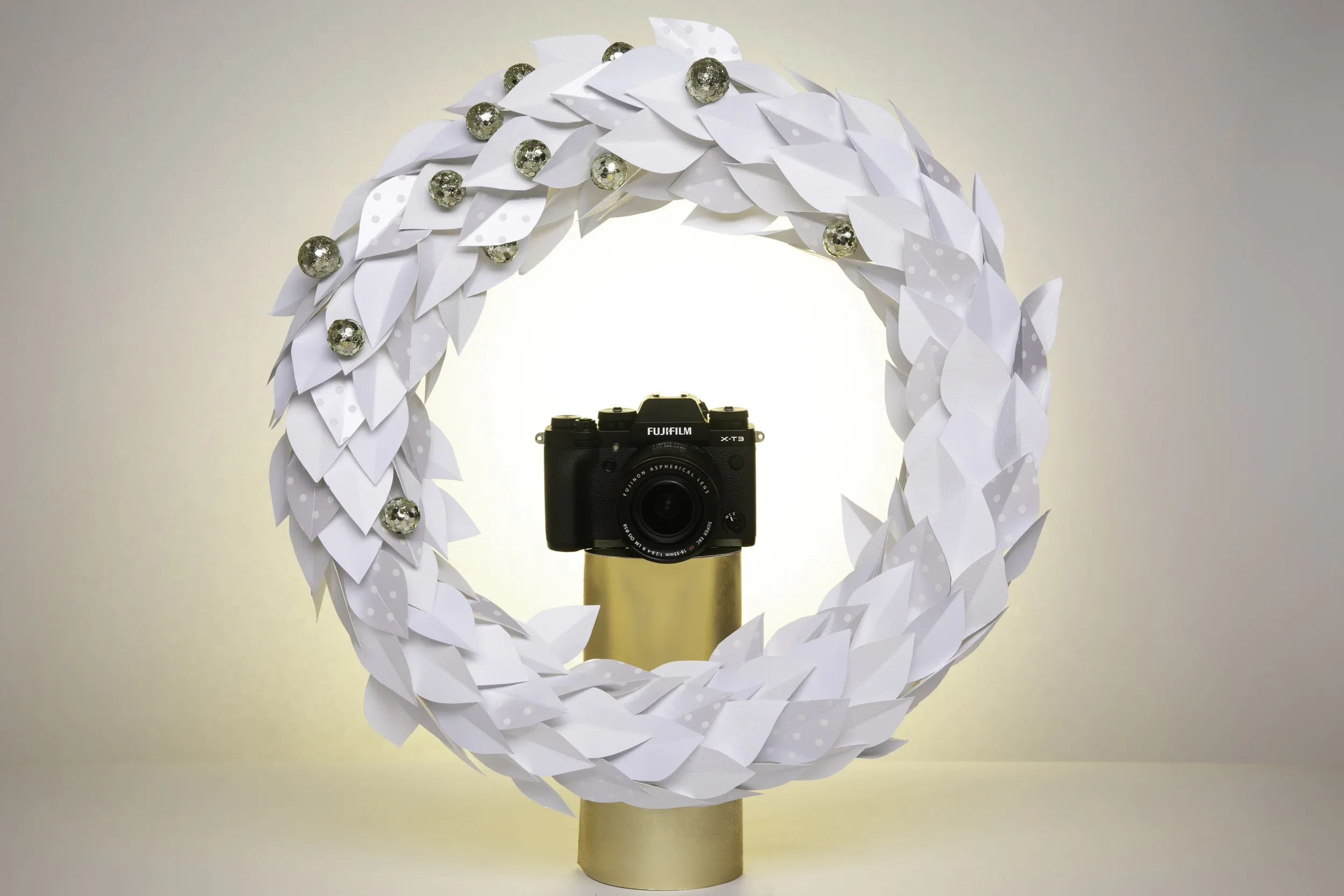
The palette was a deliberate choice. By grounding each scene in golds and whites — velvet, metallic foil, sequins, satin ribbons, polished paper — the predominantly black cameras and lenses emerged in sharp, striking contrast, commanding attention without competing with the seasonal atmosphere. Every set was built by hand: I fabricated props from paper, including a decorative wreath to frame one hero camera and cut-out pine branches woven into another composition, giving the campaign a tactile, crafted quality that felt warm and personal rather than overly produced.
The final deliverables spanned both still photography for the website and animated gifs and video for social — adapting the same visual language across formats. The campaign brought a sense of warmth and creative intention to Glazer's holiday marketing, standing out as something genuinely distinctive in a season full of visual noise.
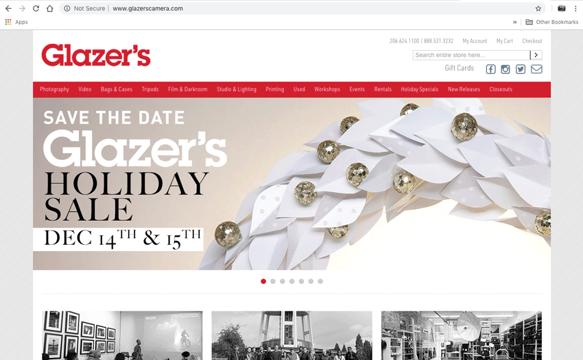
Glazer’s Homepage Hero during the holiday period