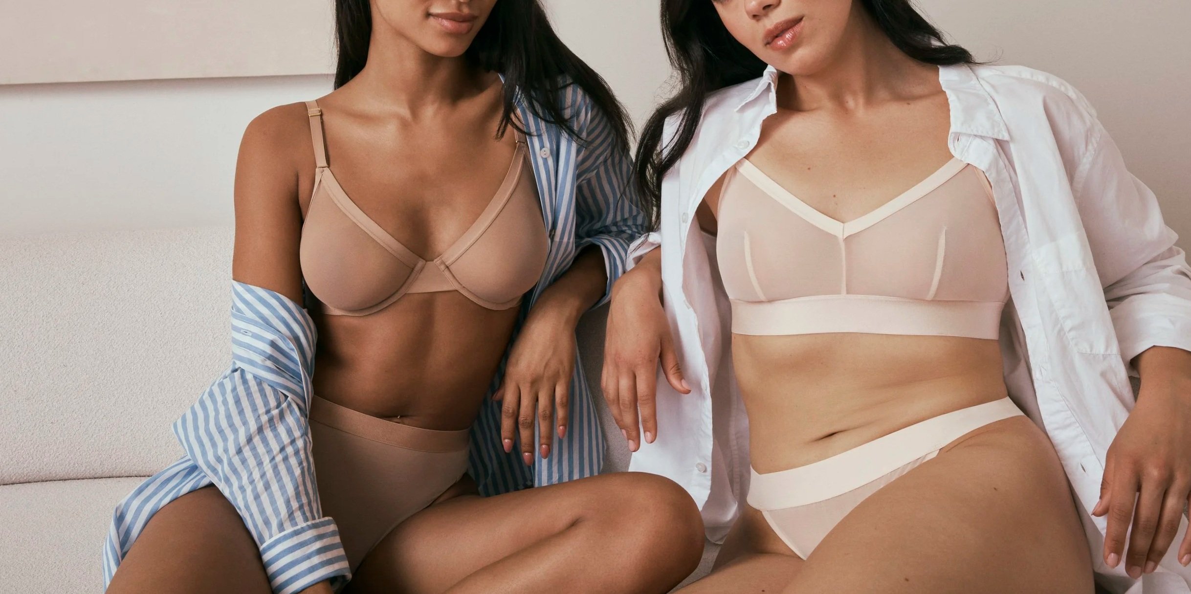
ComfortMesh™ Collection Relaunch
Harper Wilde’s sheer mesh fabrication — originally launched in 2021 as the Luxe Collection — was positioned as special-occasion lingerie, which did not align with how our core customer actually shopped the brand.
The Brand team (including myself) partnered with Merchandising and Marketing to reframe the collection around what our customer valued most: comfort, ease, and everyday wearability. The result was a full relaunch as the ComfortMesh™ Collection, with updated naming, art direction, and a cohesive marketing campaign focused on effortless, breathable comfort.
Organization: Harper Wilde
Role: Associate Director of Design
Challenge
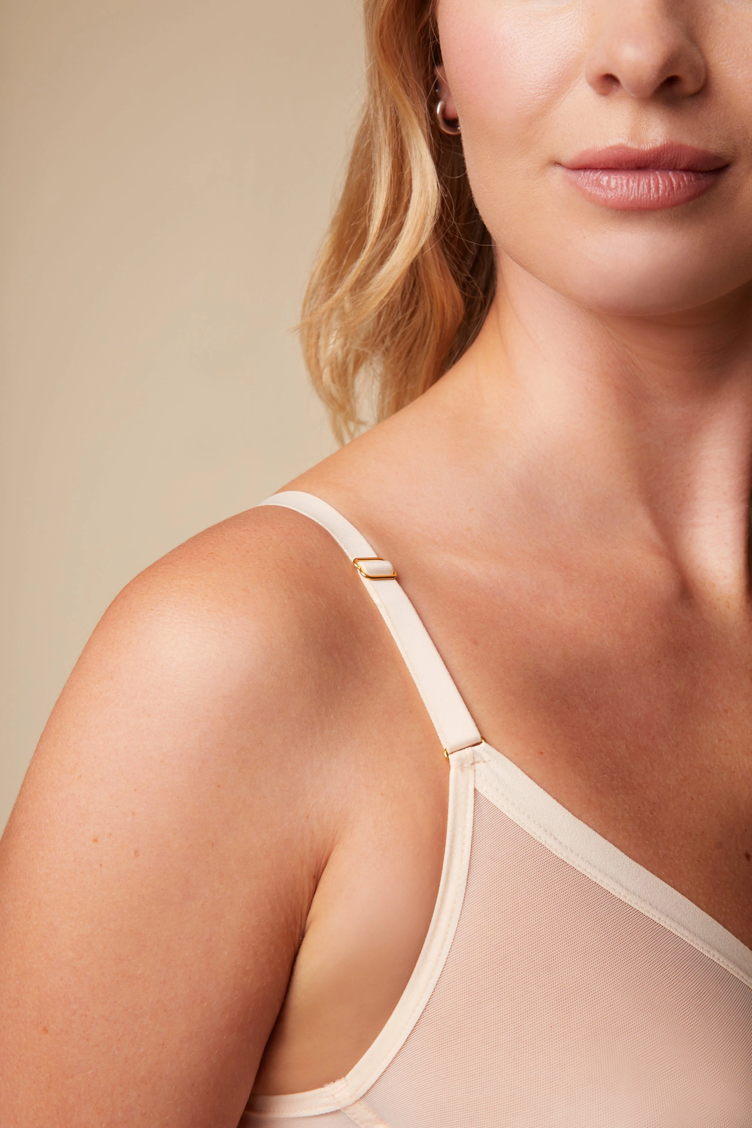
The Luxe Collection was originally designed to feel elevated and indulgent, featuring sheer mesh fabric, gold hardware, and satin elastic details. It was priced at a premium and marketed as Harper Wilde’s sexier, special-occasion offering.
However, since its launch in 2021, it became clear that this positioning wasn’t resonating. Harper Wilde’s core customer wasn’t coming to the brand for special-occasion lingerie — she was looking for comfortable, versatile undergarments she could wear every day, or styles that served a clear, practical purpose.
The challenge wasn’t product quality, but perception. We needed to:
Realign the collection with customer expectations and priorities
Reframe the benefits of sheer mesh being comfortable and breathable, not fussy or precious
Maintain an elevated look while making the products feel approachable and everyday
Strategy
As a team, we decided to completely reposition the collection — not by redesigning the product, but by changing the story around it.
The Luxe Collection became the ComfortMesh™ Collection, with a clear shift in focus:
From special occasion → elevated everyday essential
From luxury detailing → comfort and breathability
From novelty → go-to wardrobe staple
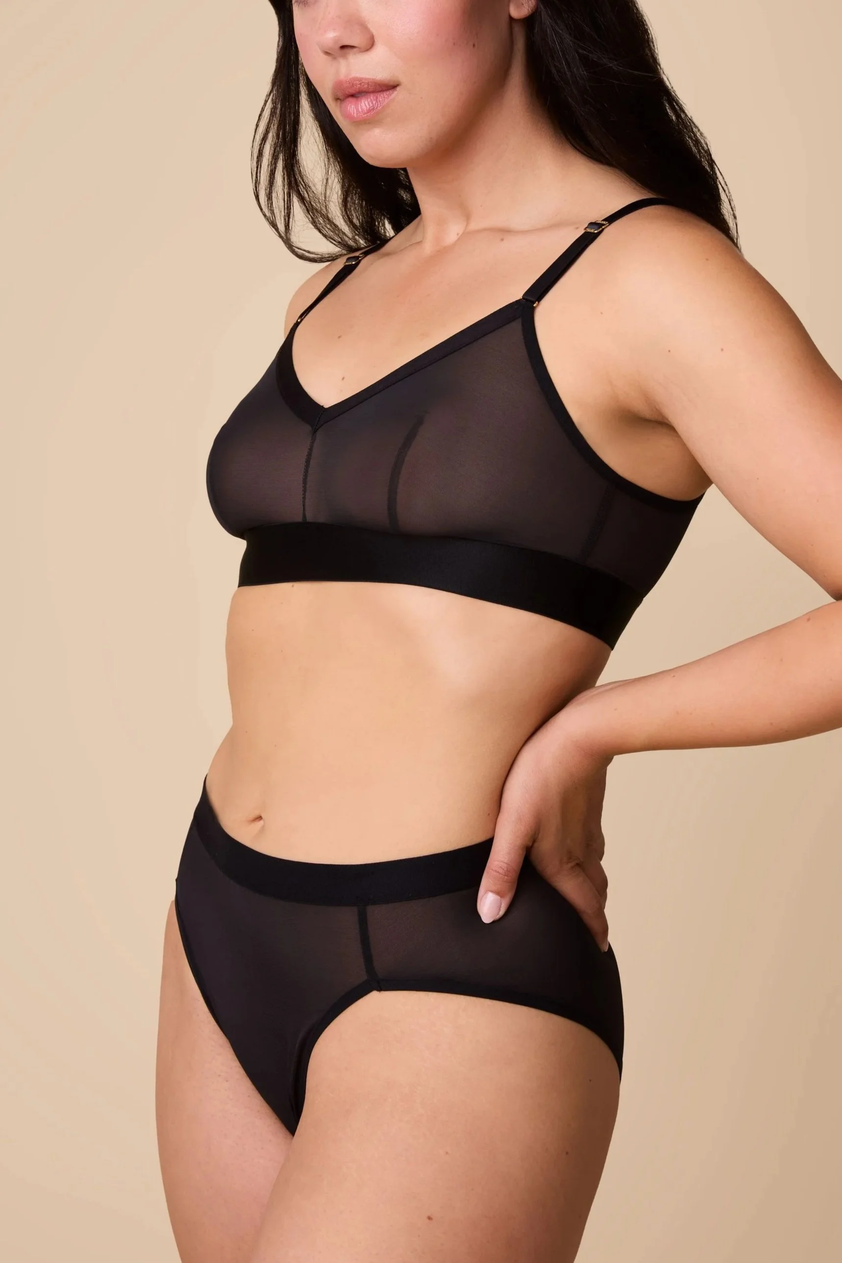
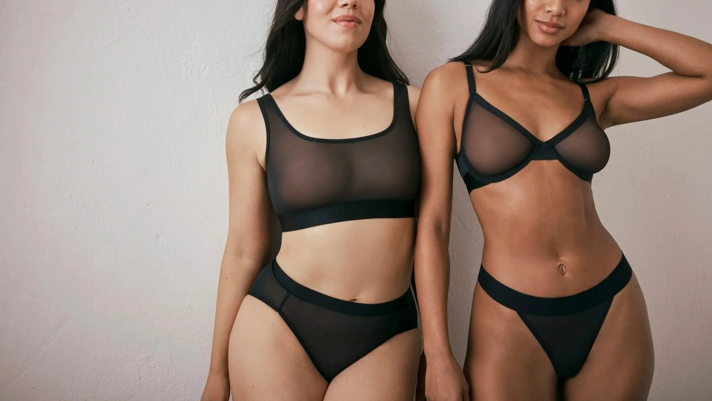
We anchored the relaunch around core neutral colors — Black, Pearl, and Taupe — reinforcing the idea that these were foundational pieces meant to live alongside customers’ everyday basics.
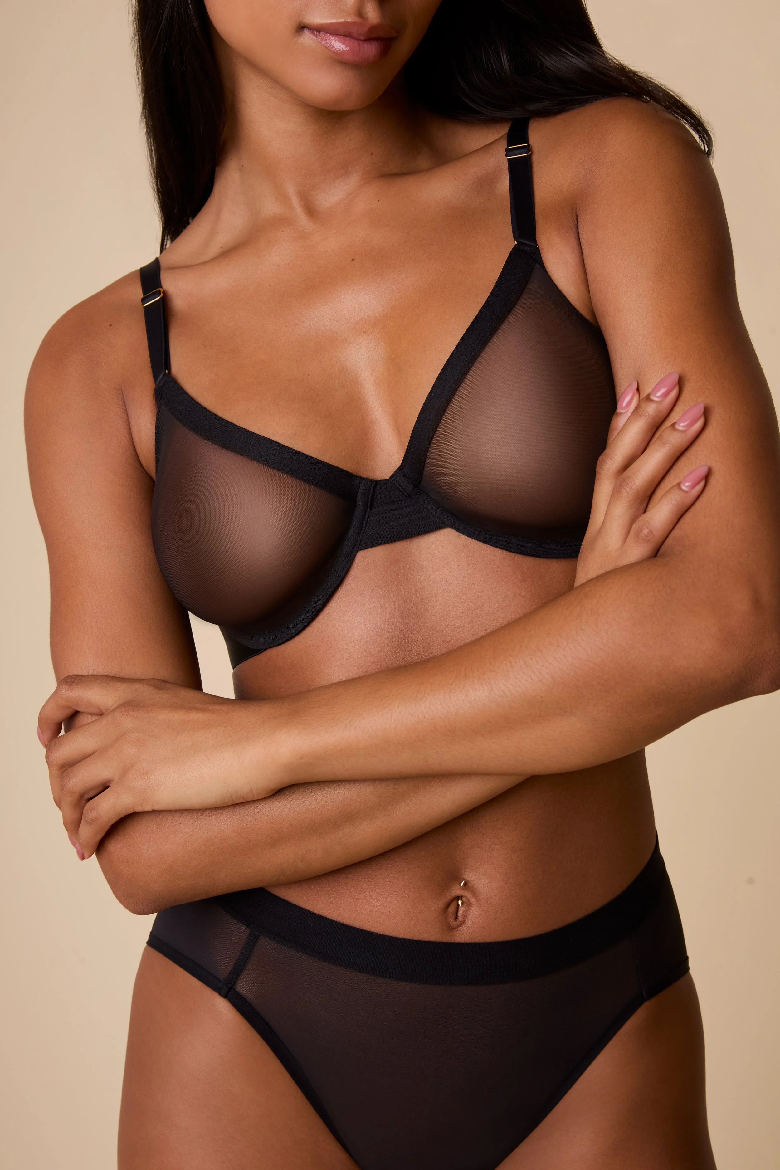
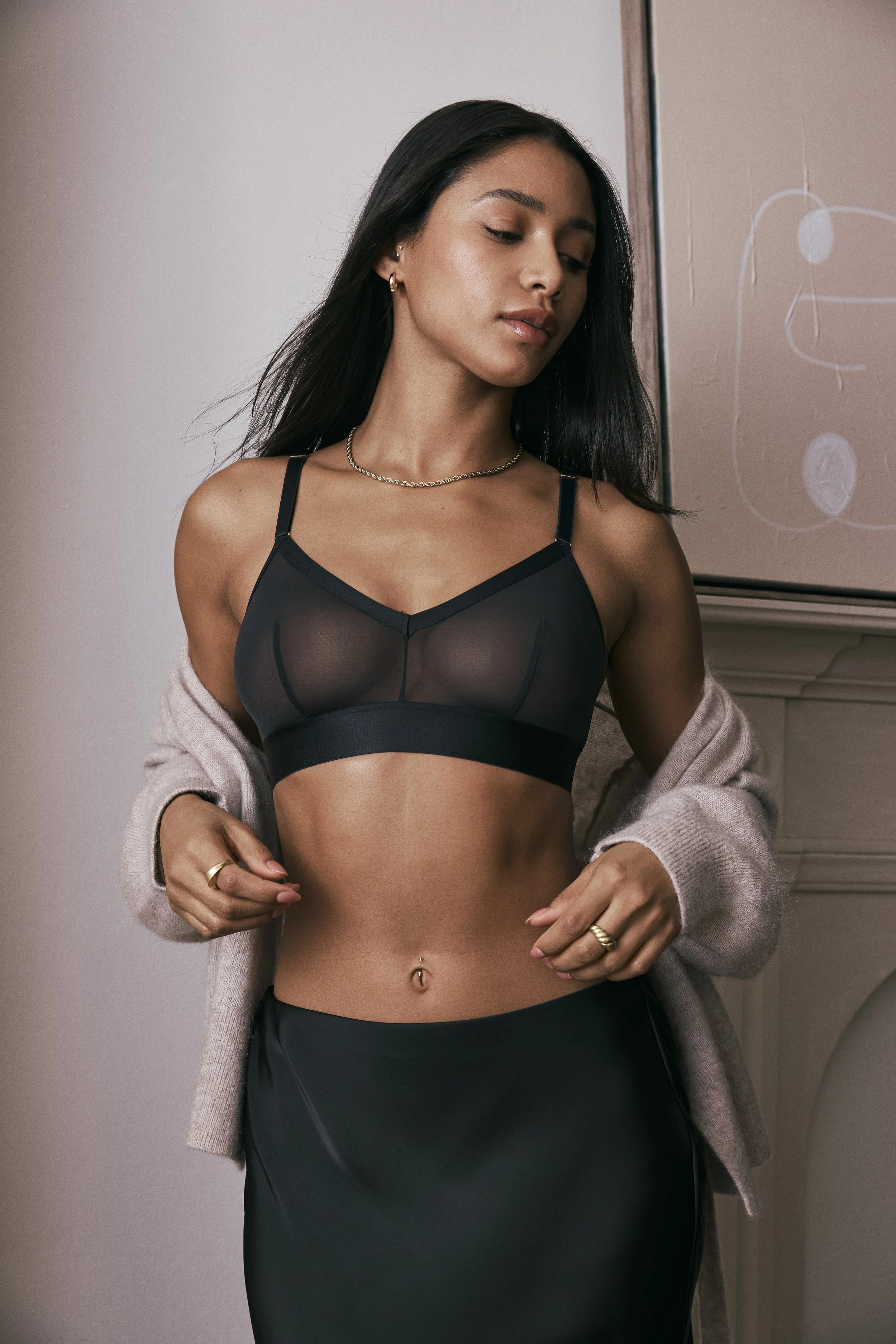
Creative Direction
I led the creative direction for the relaunch, ensuring the visuals and design language clearly supported the new positioning.
Photoshoot Art Direction
The shoot emphasized ease and comfort rather than seduction:
Set in a light, airy home environment
Styled with soft textures like boucle furniture and cozy blankets
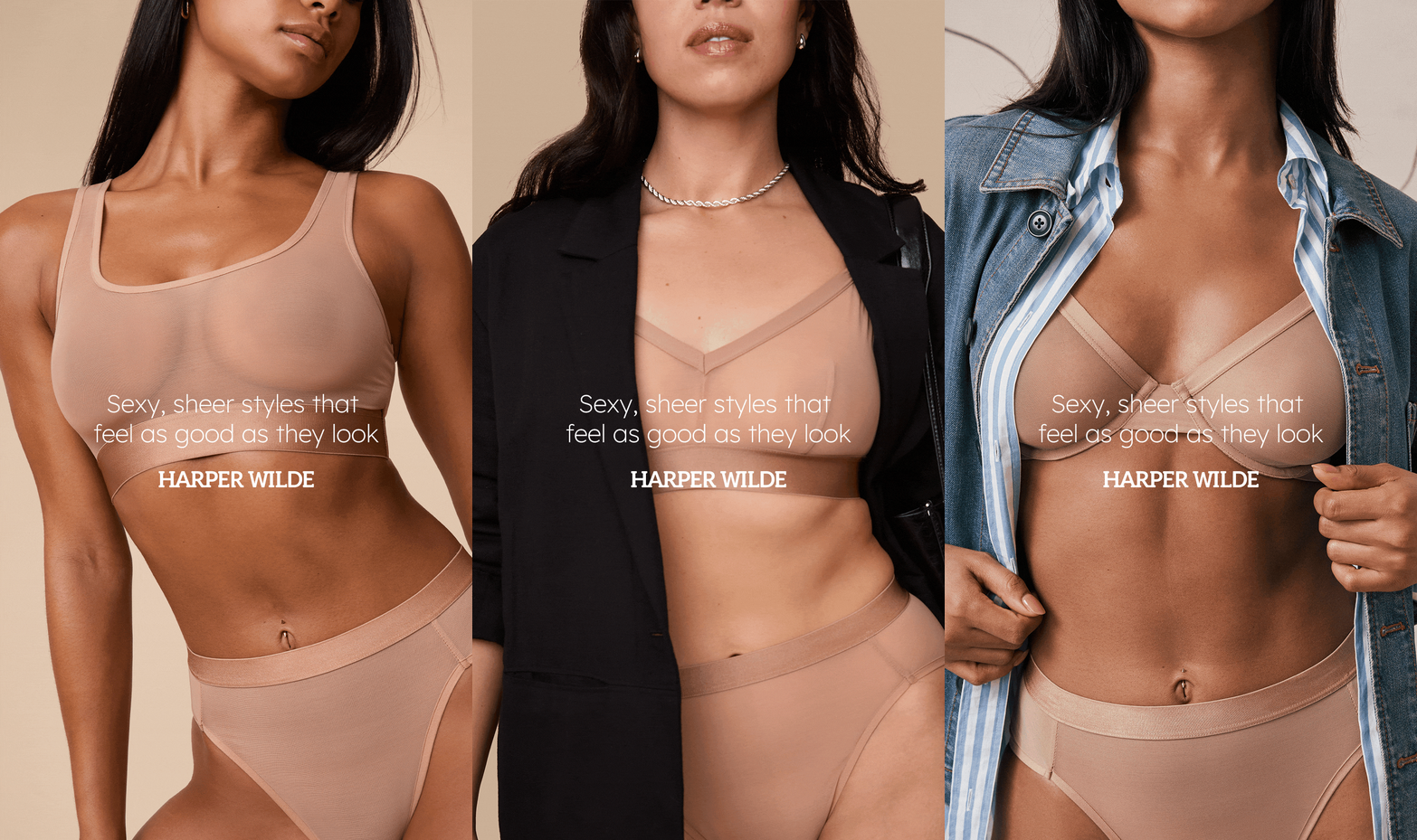
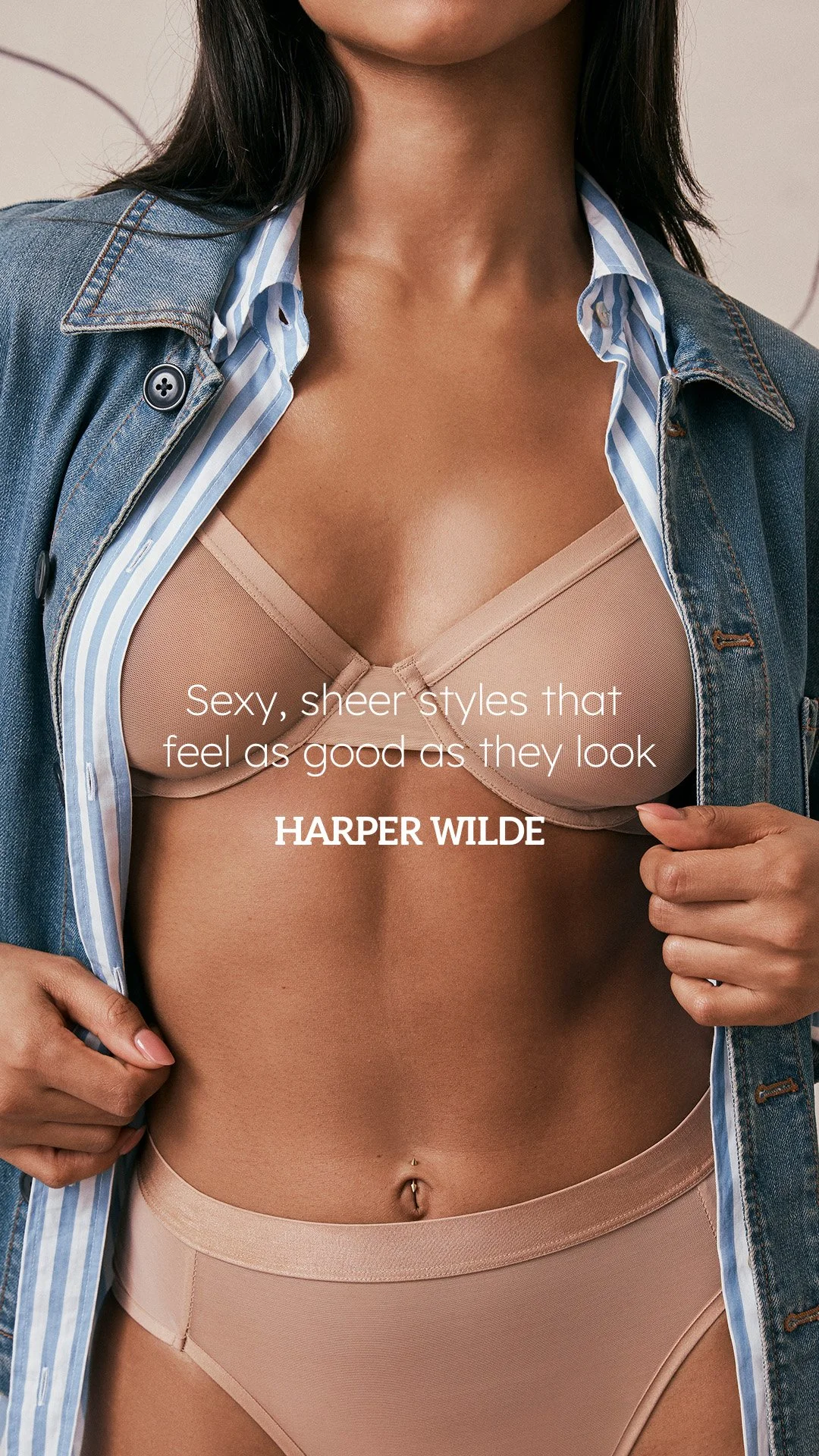
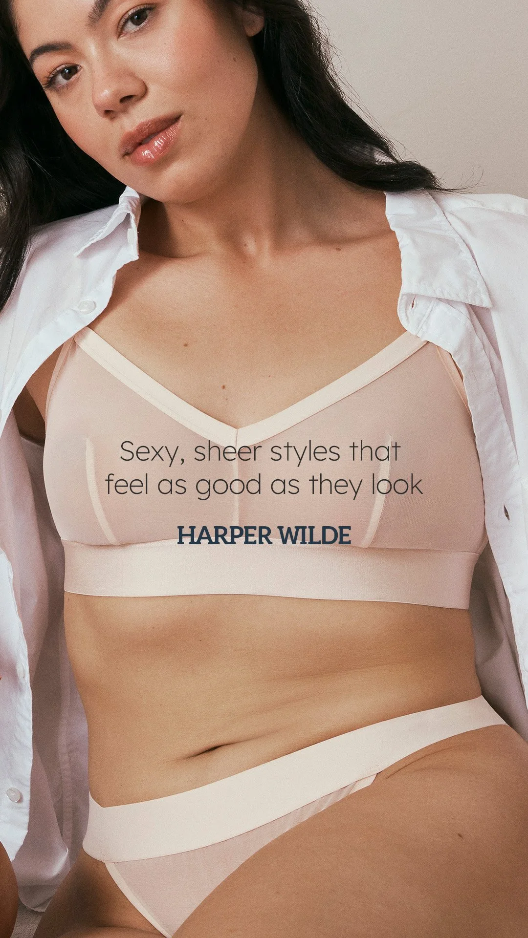
Models paired the pieces with familiar wardrobe staples — button-down shirts, denim, and comfortable cardigans — to show how seamlessly the products fit into everyday life
Design & Visual Language
For the launch campaign, I focused on restraint and simplicity:
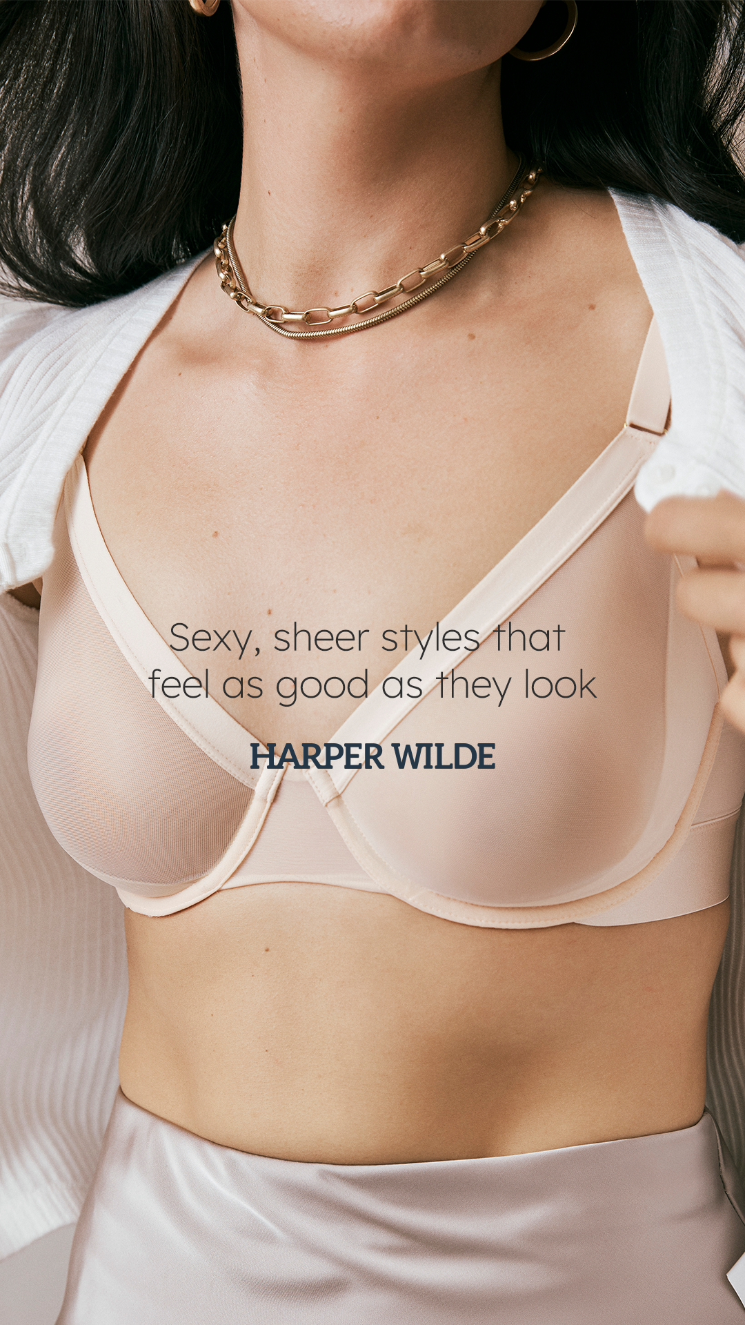
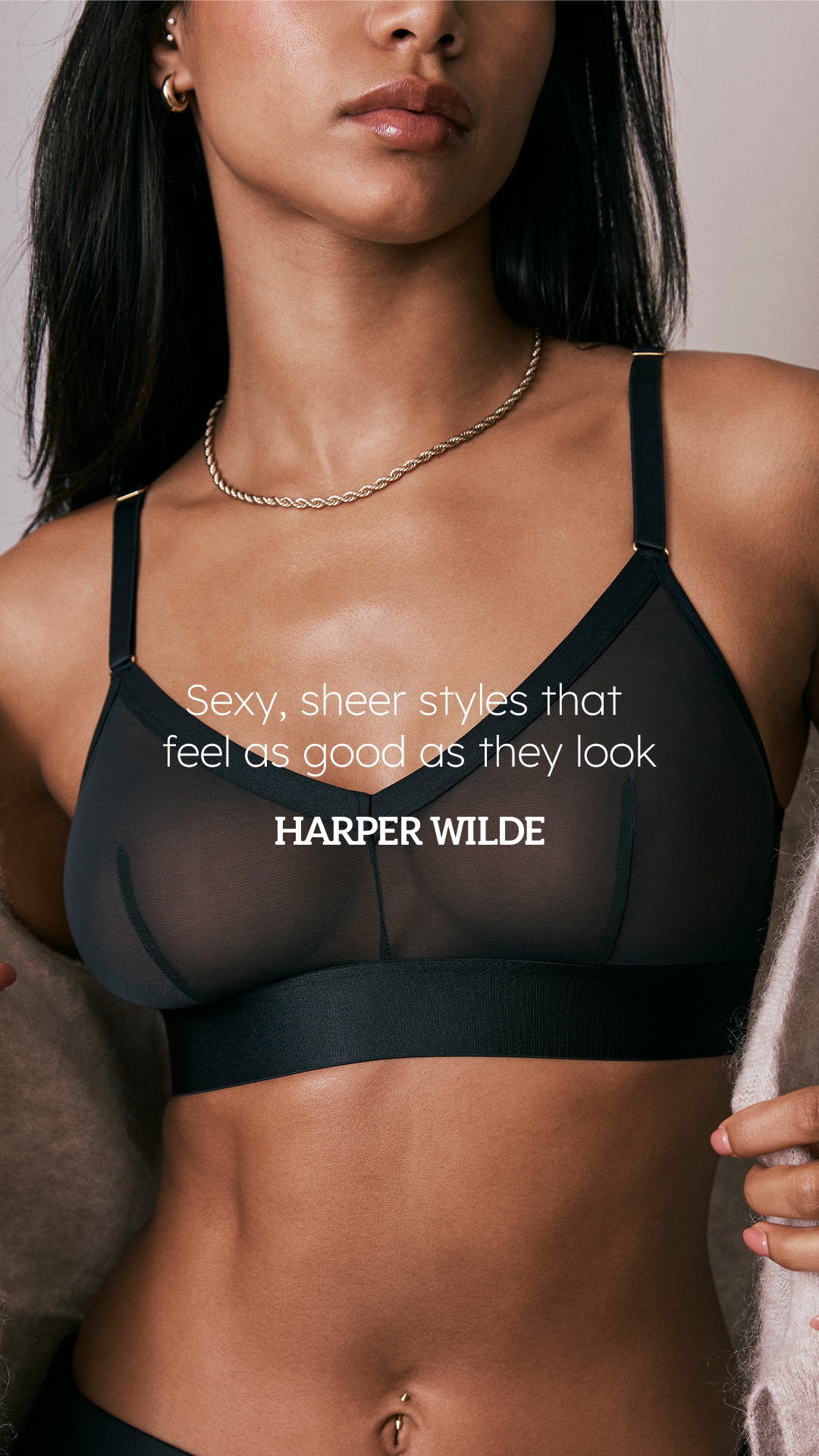
Used a lighter weight of our brand font to reinforce an airy, effortless feel
Let the photography do the heavy lifting, minimizing visual clutter
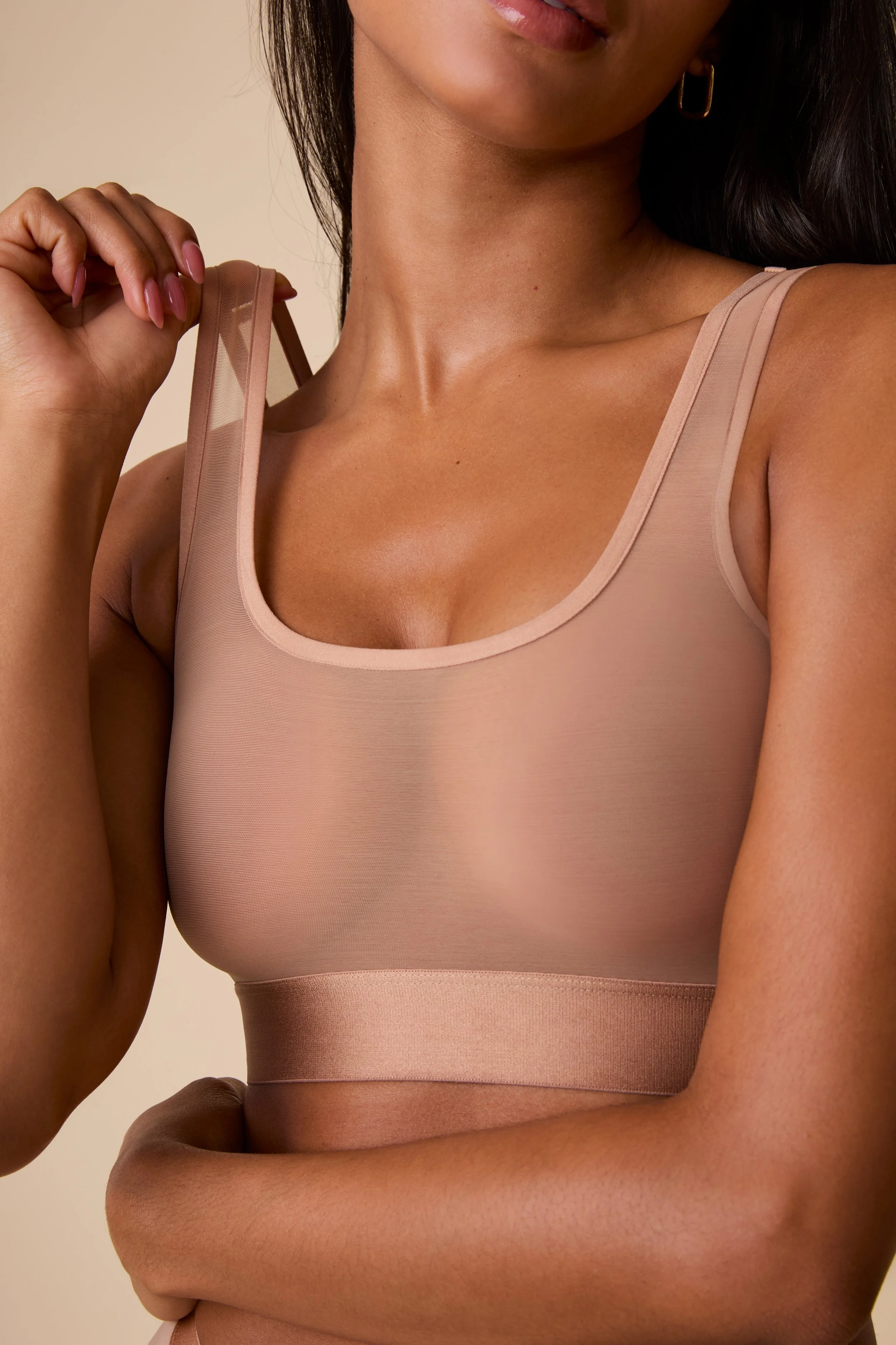
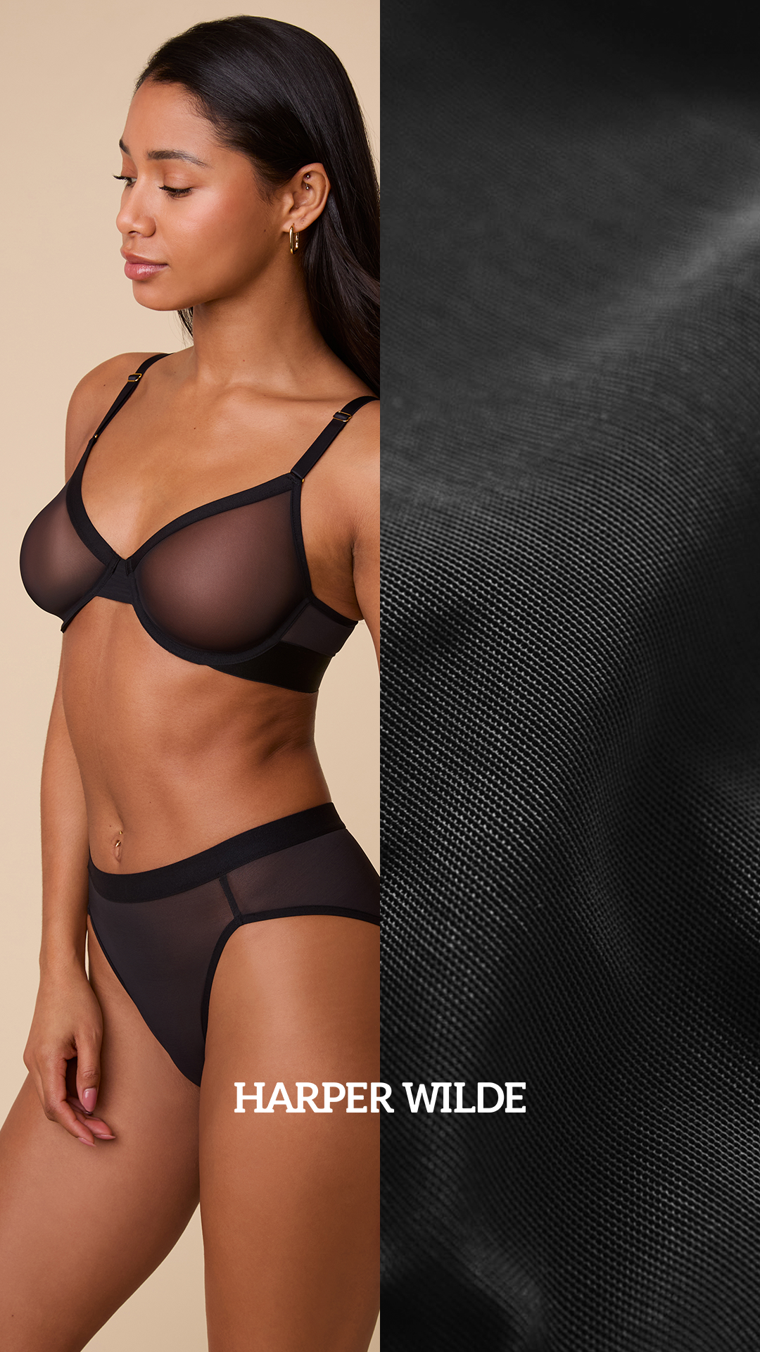
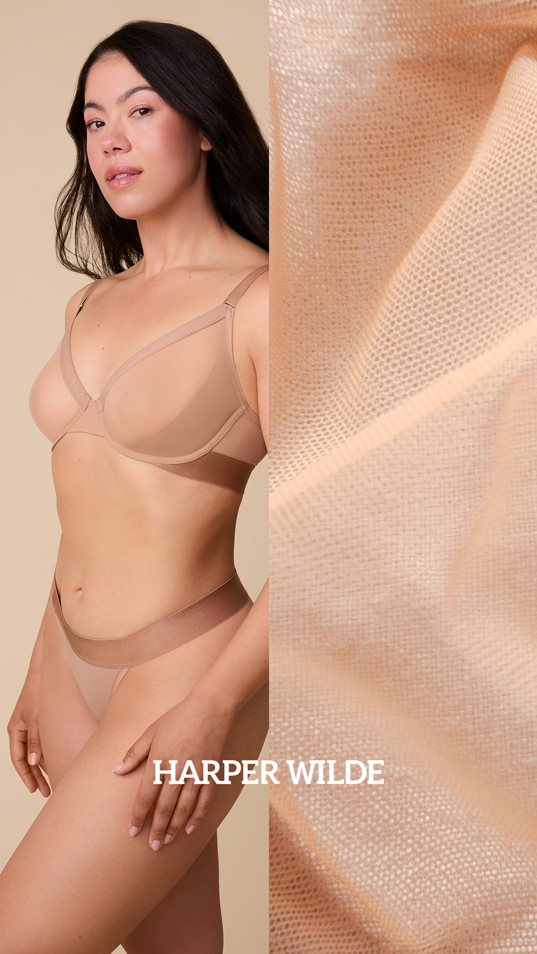
Emphasized tight product crops to highlight the sheer mesh fabric and thoughtful construction details
Copy and design worked together to balance key attributes — sheerness, sexiness, comfort, and wearability — without leaning too far in any one direction.
Campaign Creative
Website
Homepage takeover
Dedicated ComfortMesh™ collection page header
E-commerce image carousels for each product
Launch emails
Version sent to previous mesh purchasers focused on comfort and price reduction
Version sent to customers who had not previously purchased mesh focused on comfort and everyday wearability
Re-engagement email with product benefits featured
Paid Media
A suite of static and slideshow-style ads featuring one headline with several image variations to test in-platform
A suite of static ads featuring fabric detail images
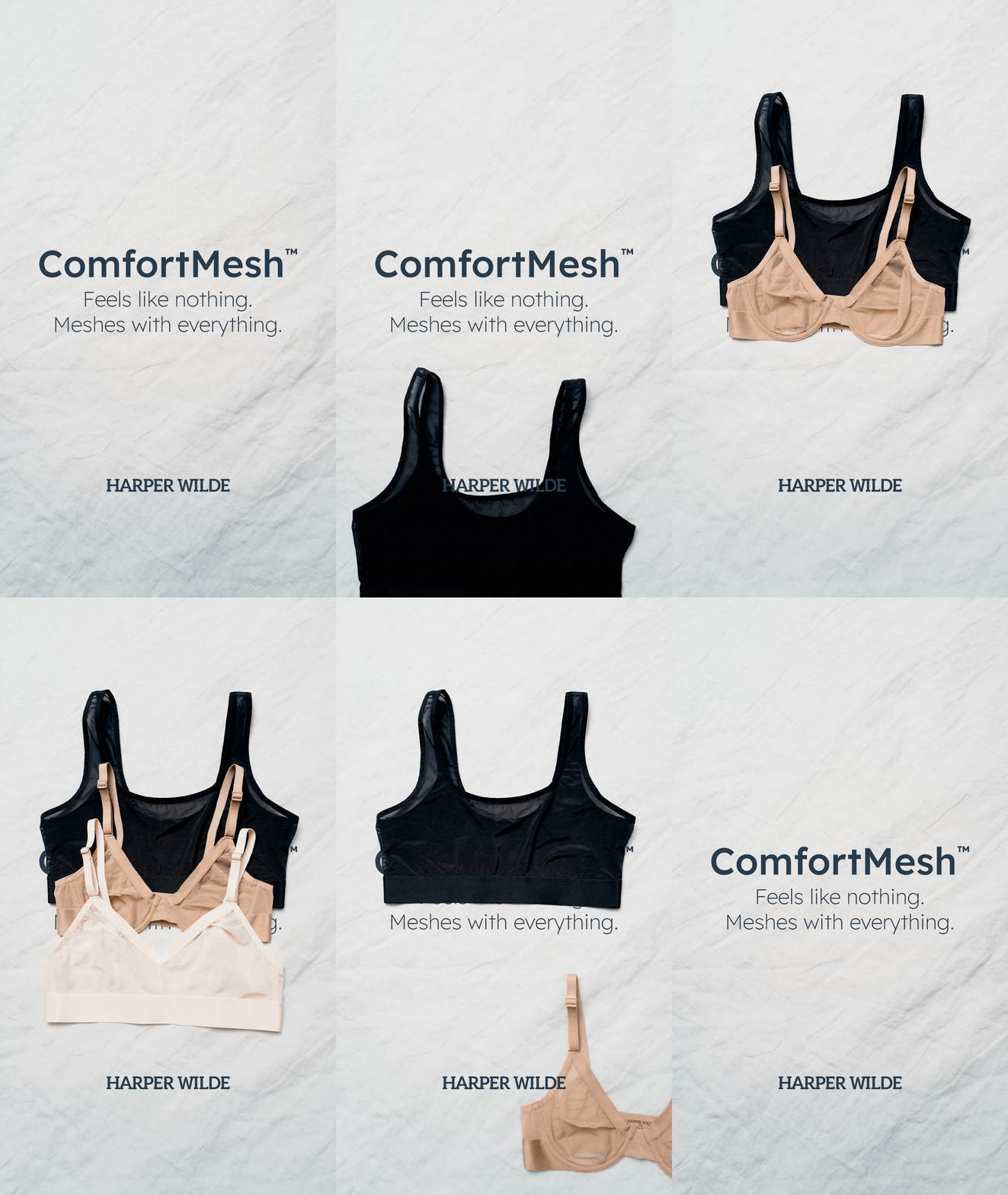
One animated stop-motion product flatlay ad
Website
Homepage
Desktop
Mobile
ComfortMesh™ Collection Page
Desktop
Mobile
Launch Email — Past Purchasers

Launch Email — Non-Purchasers

Re-engagement Email

Paid Media

Impact
The relaunch had an immediate and meaningful impact on performance. Sales saw a significant lift, with select SKUs selling out before replenishment orders could be placed.
Beyond revenue, the project delivered valuable insight:
It confirmed our theory that Harper Wilde’s core customer prioritizes comfort and functionality over pure looks.
It validated that the product itself was strong — it simply needed the right framing to resonate with our customer base.
With renewed confidence in the collection and its positioning in our assortment, the Merchandising team invested in new limited-edition colorways for upcoming seasonal launches, turning a previously underperforming line into a growth opportunity for the business.